
THE CLIENT
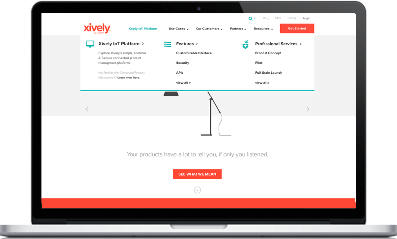
Xively by LogMeIn is a leading Internet of Things (IoT) SaaS company that powers innovative, smart technology.
THE BRIEF
To capture more leads and gain broader market interest in their IoT platform, Xively needed a website that would make a relatively complex product easy to understand and appealing to anyone with a product looking to innovate.
Conduct a website review and develop information architecture recommendations.
Develop the story further, build a new site for the brand and test it.
SOLUTION
Map out the primary persona's user journey.
Build wireframes for the website that meet the user wherever they're at in their IoT journey.
Lead with simple and engaging use cases that would make the value of Xively's platform come to life.
UX DESIGN TECHNIQUES
Content assessment | Affinity mapping | IA | Design studio | User journey map | Component workshop | Axure wireframes | Prototyping | Usability testing | Content workshops
TOOLS
Screaming Frog | Excel | Google Analytics | Pen & Paper | Post-it-notes | Axure | UserTesting.com
TEAM
Creative director, strategist, UX designer, visual designer, media analyst and account executive. I was the UX designer.
DURATION
3 month project.
Deliverables
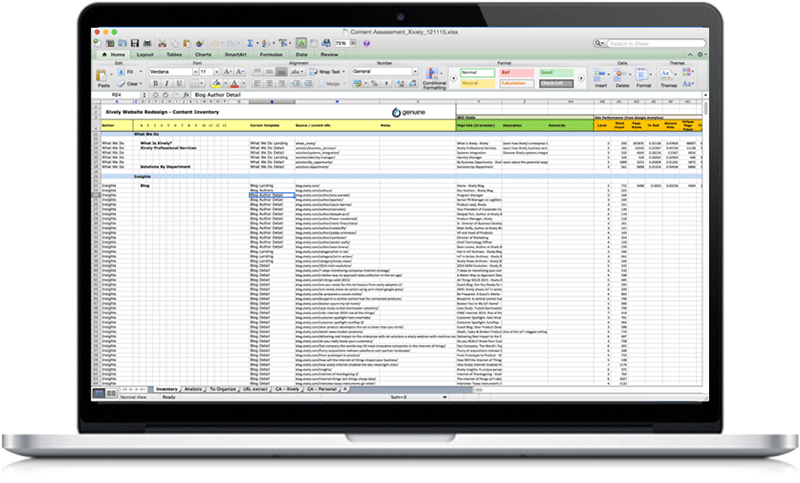
Content Assessment
Sitemap
User Journey Map
Clickable Prototype
User Testing
Functional Annotations
DESIGN PROCESS
The design process illustrated below shows the path I took over the 3-month design stage, demonstrating how I diverged and converged throughout the project.

Discover
STAKEHOLDER INTERVIEWS | COMPETITIVE ANALYSIS | CONTENT ASSESSMENT
APPROACH
To kick the project off, the team strategist, media analyst and I began researching competitors in the IoT space (PubNub, ThingWorx, Salesforce, GE, and more). We also interviewed key stakeholders (the lead of Field Sales, Senior Director of Business Development and Partnerships, and the VP of customer architecture), and ran a content assessment of Xively's current site. After running the content assessment, conducting an in-depth competitive analysis and unpacking the insights from our stakeholder interviews, we were able to extrapolate from our findings insights that would define our strategy and highlight opportunities for the new site design.
FINDINGS
The new site would need to educate potential customers around the value and benefits of IoT and help them visualize the bigger picture; qualify customers based on where they were in the connected product journey; provide someway to interact with the product to truly understand like with a free trial; and build trust and consideration by showcasing Xively's history in the connected space.
DEFINE
AFFINITY MAPPING | IA | DESIGN STUDIO | USER JOURNEY MAP
Affinity Mapping and IA
Knowing what our goals for the site were, I set off on mapping out the new structure for the site. To do this I wrangled up some folks on the team and conducted an affinity map workshop. All participants wrote down on post-its everything they thought should be included on the website (e.g. case studies, partnerships, about us, interactive experience, free trial, etc). We then took our post it notes and started grouping the items we thought one would find in a certain section on the site or that answered similar questions/needs. And from there we labeled these groupings and had a solid first pass at the site's structure. Taking these results, I set out on the task of really getting down to brass tax, sorting the various elements of the site in a way that would best guide our user's through their IoT journey with Xively and highlighting for the client areas which would require new content creation. I also as the project went on would take a component-based approach to the site's structure which is why included in the breakdown of the site's information architecture is the component library which we mapped to the various sections of the site map after a couple content workshops with the client.


Design studio & User JOURNEY MAPPING
While not in scope, we developed a user journey map to help show how the new site design would help Xively's primary audience flow through their IoT journey. To compile the user journey map below, I hosted a design studio session, pulling in team members from various disciplines as well as a few of my UX teammates. In this session I briefed the team on Xively's primary persona and gave them an empty framework I had designed to capture what they thought this persona's journey would look like as they moved through the various stages of the conversion funnel, noting what they thought the user would be thinking, doing, feeling and how the website could be meeting them in the context of these things. I again went back and working with insights from different folks, compiled the user's journey map.

DEVELOP
COMPONENT WORKSHOP | AXURE WIREFRAMES | PROTOTYPING | USABILITY TESTING | CONTENT WORKSHOP
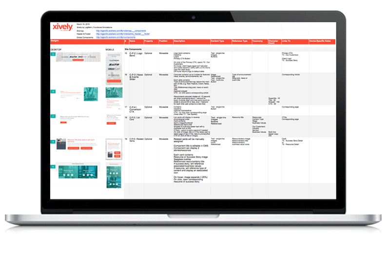
Component workshop
With a plan in place for our site's structure and an understanding of how the user's journey would map to it, the visual design team developed 3 creative concepts while I set off sketching out templates. When we got feedback on the direction the client wanted to go with the design, I began to build the wireframes in Axure. Before getting too far, as I was creating master elements within my file which could be used repeatedly on different parts of the site, I realized how much of this site could use a set of repeatable components that would help the user digest a more complex story in a snackable manner. So I took a step back and went to the drawing board. Here I did a similar exercise as with the affinity map workshop. I wrote on post-it notes everything I planned, content-wise, on making sure was included in the site and organized this content by where it would live in the sitemap. From there I started going through section by section quickly identifying the necessary elements for each and sketching how those elements could be presented. As I went through all of the sections, I started identifying what sections could use a previously suggested component. By the end I had a pretty great idea of the components this site would need to tell the Xively story the day of launch.
Wireframes and prototyping
With a solid game plan in place after the component workshop, putting together the wireframes in Axure was like working on a really fun puzzle. The part that required a little extra thinking, as it usually is, was the navigation. I ended up designing 2 approaches to the navigation, one that was simpler with the idea that it may focus the user on answering their most basic questions: what xively is, how does it works and how do I get started. The alternative approach was a mega nav which might allow the user to feel a greater sense of control over the information available to them, making the process of learning less daunting. When we presented the two approaches to the clients they loved them both and wanted to see how users might react with testing. So we did just that!
User Testing
Below are the two prototypes we tested with the different navigation approaches. We used UserTesting.com and had 5 users test each prototype, and let them know when they began the test that this was a prototype of wireframes and that the site was not fully developed out, but to do their best navigating the tasks as they could. Outside of this we were careful not ask leading questions or guide users to the answers we wanted to them to pick and the results were fascinating.

Hands-down, across the board users found the mega nav easier to use and over all were able to get to the areas of the site with the greatest success rate using it. We compiled the results from the test and shared our findings with the client, after which we implemented edits based on the findings from testing.
Content Workshop
Finally, before delivering the completed wireframes and moving on to the design phase, we conducted a content workshop with the client using shells of the component library to identify the exact content they would want on each page of the site which we would later map to the site map as a guide for how their team would build the CMS and how their content admin would populate the info once at that stage.


Mapped out content on site with clients using the component library and then added to sitemap
DELIVER
FINAL WIREFRAMES | FUNCTIONAL ANNOTATIONS
Final wireframes & Designs
We delivered the final round of wireframes to the client and once approved began designs. I helped consult with the designers on the final design and once designs were locked I annotated the work in Google Sheets where developers could find the most current designs, links to the wires and explanations of the site's functionality.


SUMMARY
LESSONS LEARNED
There were a couple things I wish we had done differently on this project. For one, I learned that when a subject matter is complex and we are dealing with a more nuanced user flow, scoping for a journey map is key since you'll end up needing to do one in the end any way to really tie the experience together. I also wish we had been able to coordinate the content workshop with the client earlier, like shortly after the content assessment, in order to gain clarity upfront on what content needed to stay/go/be revised.
UX DESIGN TECHNIQUES
Content assessment | Affinity mapping | IA | Design studio | User journey map | Component workshop | Axure wireframes | Prototyping | Usability testing | Content workshops
TOOLS USED
Screaming Frog | Excel | Google Analytics | Pen & Paper | Post-it-notes | Axure | UserTesting.com